How do I show the breadth of the project without boring the audience silly? Below are the followup designs I created after the original fish design. Which, if any, would you include in a portfolio? And for the ones to include, are there any changes you would recommend?
NOTE: The web banner with the blocks was requested by the client. It has bothered me that there was too much tiny text on it. Considering that the banner is seen every time anyone logs onto iConnect, I suggested a change with I hope they will upload sometime soon. The change is included below.
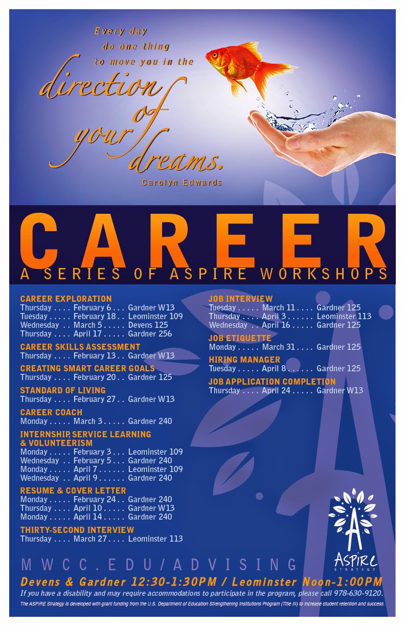
The advising page—http://mwcc.edu/advising/workshops/—shows the tiny text that was removed on the second series I designed.
| "Coming together is a beginning; keeping together is progress; working together is success. —Henry Ford |
| If you don't design your own life plan, chances are you'll fall into someone else's plan. —Jim Rohn |
| College is part of the American dream. It shouldn't be part of a financial nightmare for families. —Barbara Mikulski |
| Keep your dream close and you'll go as far as the stars. —Joseph Farmer |
| Every day do one thing to move you in the direction of your dreams. —Carolyn Edwards |

 |
Recently revised web banners. |


Topic art on the Advising webpage. |

 |
Five bookmarks (front and back)—5-up. |
 |
| Monthly table tents (finished products are folded in half). |


There is such a large volume of amazing work here, Sue, that it almost overwhelms me, so that I hesitate to offer any guidance. Your question is probably best answered by Coni, who I feel has that expertise. Having said that, I would suggest you consider including an example of each different fish design (circle, fish bowl, light bulb, dollar sign, fish jumping from hand).
ReplyDeleteSue, this design project is really quite successful and besides just a few tweaks in a few spots not much needs to change in my opinion. It could/should take a primary spot in your portfolio because it shows your skills in layout, color palette use, and image selection as well as depth of design consistency.
ReplyDeleteYou ask how many separate pieces in a series should be shown, to suggest depth but not to bore the viewer. Good question - and my answer for you would be to allow this project to inhabit 2 spreads in your book, the first holding the print pieces and the second spread holding the web work. Creating a compelling composition of the individual pieces will be your challenge. I'd suggest you think about how you could use mockups to show a few of the pieces in context (especially the ones that presently have pieces upside down - like the table tents). The mockups will also add variety to the composition of the 2 spreads.
There are many free mockup sites - here is one that includes digital media mockups as well as table tents, etc. Most are for use with Photoshop: http://www.ultraupdates.com/2014/08/free-psd-mockups/
Here are the few tweaks I would suggest:
1. The first piece at top holds the type "Working Together is Success" - which is a phrase that should be seen with consistent leading between its lines. This is the only one in the series with inconsistent leading in the area where you this font with large swashes. So - if this can't be solved, then this might be one I'd recommend you drop.
2. In many of the pieces I see a very dense list, with yellow subheads and white type following. It would be more inviting to read, in my opinion, with more negative space separating the workshops, between them.
It is interesting to me that you chose to use leader dots between your tabbed items in this list... that also adds to the density. Are these lists made in InDesign using the Table feature? I don't think so - and in this case I would really recommend it because I think that feature offers you alternatives to using simple tabs. The Table feature allows some nice styling to happen - which could replace those dots with other ways to help the eye track across the list (like alternating colors for the rows). Give this some thought - because they play an important role in the design, and are a major page element - so it's worth consideration.
There are a few good Table tutorials on line, I just found this one and chose it because I like the look of the table (looks more like a list): https://www.youtube.com/watch?v=a-xNzyd3XTc
That's it really - otherwise these are really strong designs. Eventually you'll be deciding how many table tents to show (the mock up had 3 on a table, which should be enough), and how to show the bookmarks (maybe trimmed down and fanned out). You'll be asking yourself what areas of what pieces are the strongest, and making sure those show up front. Some of the other pieces can peak out from behind, showing just enough to establish that "depth" of series that we've talked about.
Hope this helps.
Addendum to my comment above -the "Topic Art on the Advising page" if used as separate items as you've uploaded them here, are also good candidates for use in a mockup (iphone?) because we've seen them in the banner already - so something has to offer us another visual experience... or it's just repetitive.
ReplyDelete