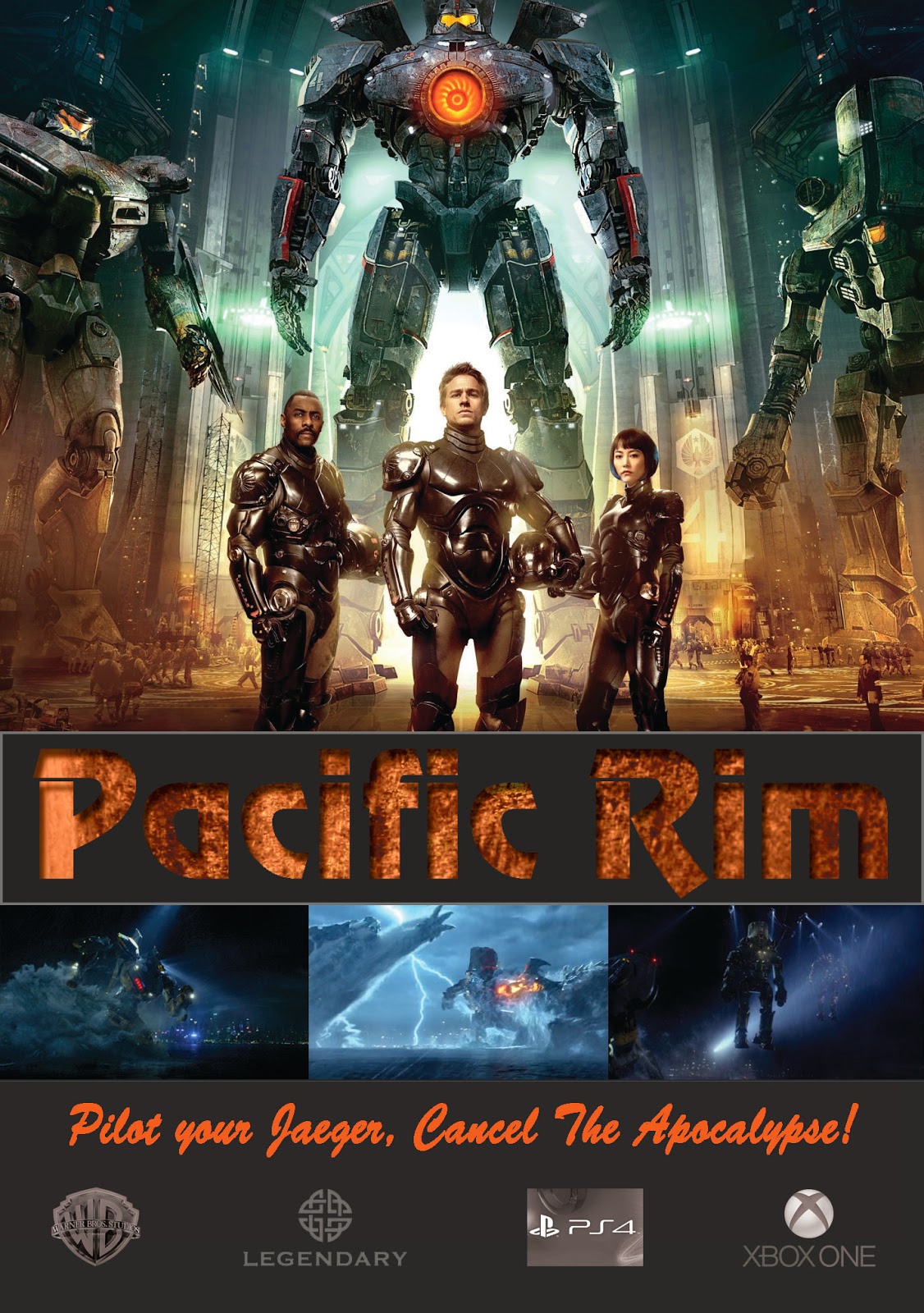
This is my solution for a DVD cover, insert, and DVD label for the movie Pacific Rim. Things that I have changed are brightening the orange pacific rim title on the cover, spine, and insert. I also brightened "spectacular" on the back cover. The body copy on the back cover was bold I changed it to regular and slightly increased the font size to increase readability. I adjusted the legendary emblem on the spine so it is more evenly spaced between Warner bro's emblem and DVD. I also made adjustments to the legendary emblem on the DVD and insert to add contrast. On the DVD I removed the opacity on the pacific rim title and increase the stroke size so it wouldn't get lost in the background.


Nice changes to the text, Greg. The brighter orange really helps with readability. And the descriptive text on the back looks much better now.
ReplyDeleteI just have a few suggestions for DVD disk design.
1) Add the orange "Pacific Rim" text to the disk, too, to add continuity between the disk design and the cover and insert.
2) I might even add the orange WB logo as well, but I would move it down slightly so that it is grouped more closely with the Legendary logo.
3) Change the DVD logo to one of the following:
a) Make it smaller and move it to the space below Rim.
b) Group it with the WB and Legenary logos. They don't need to be very big.
c) Change it to white. (However, you may not want to do that because of the dark nature of the overall design.
Nice work overall.
Greg, this piece has great promise because the typography and images work well together. Some thoughts:
ReplyDelete1. DVD cover: front cover looks done to me, nice job. I enjoy the elbow from the monster moving across the spine to the back cover… a nice touch that brings unity to all panels of the design. Back cover holds a nice type wrap and strong asymmetrical design. My only suggestion involves the color and placement of the bar code. These days, bar code readers can work better than in the past, and the background behind the bars does not have to be white. That is good news for this design, because the current bar code draws the eye and becomes the initial focal point because of its high contrast. So, think about using a light value that is darker than white.
Where else can it be put? Not too many other places would work – but have you tried to pull it over to the left, and change positions with “Spectacular”? You could use a headline-like element above your text type paragraph so maybe this is the answer. Not sure – but don’t give up, you’ll find a solution and the perfect place for this bar code (it can also be turned on its side, if that’s helpful somewhere).
2. Insert: I notice that your middle photo, within the line of 3 photos below title, is much brighter than the others. I think the idea is good, but maybe this one is too bright for the rest of the cover and a bit too different than the others… or maybe the others are too dark? Less contrast here would help keep our eyes up top and read in a descending manner – which I think you mean to have happen, but doesn’t quite happen yet. Think about Visual Hierarchy, and how you want someone’s eyes to travel.
3. Layout is great, but of course I do wonder why we are seeing a black version of the title? Why not use the orange version? It will be more visible because it will add more contrast to the area, and it will appear more clearly situated within the series of designs. Consistency in branding – a good thing when the brand is well designed… as this series is.
I like this design a lot. I would agree with Coni to change the color of the title on the DVD label to orange; much more effective. However, I'm going to disagree with Coni about the cover. I'm having trouble reading text on both the front and back of the cover. I think the orange still needs to be brighter. The darkness of the ocean nearly obliterates the credits.
ReplyDelete