Showing posts with label Greg. Show all posts

Wednesday, April 29, 2015

Website logo/ header

Here are a few versions of I came up with what do you think?


Saturday, April 25, 2015

Magazine rework

Just realized I hadn't posted my magazine rework. what do you guys think?

Nazi poster rework

Reduced size of circle, emphasized last sentence of the quote, moved some of the figures around in an attempt to show more people saluting.

Monday, April 6, 2015

Digital Booklet Rework

Here is My digital booklet. On the cover "to" was move right of the Y in halfway rather than trapt between the H and Y. I adjusted the leading between halfway and heaven bringing them closer. I made sure the red bar on the tan pages matched the red song titles on the opposing page. I changed the font color on the last page to blue to increase readability from the shade of green I had used before. Also I did a quick illustration of the V8 emblem used on the black lyric pages.


German Resistance poster

Rework of my german resistance poster I added a foe shadow to "German Resistance". I moved a few of the people around in an attempt to show more recognizable people saluting. Also fixed spelling errors and added hanging quotation mark.

Tuesday, March 31, 2015

Extinguisher Rework #3

Well I have enhanced the surface the extinguisher is on by creating the "End" of the table. I also lightened the shadow so you can see the table through it. Moved it all to the left to make room for the type. Played with the typography a bit, put a text wrap along the extinguisher as evident in the first illustration. The background was also swapped out from the ugly green gradient to this light shade of gray.

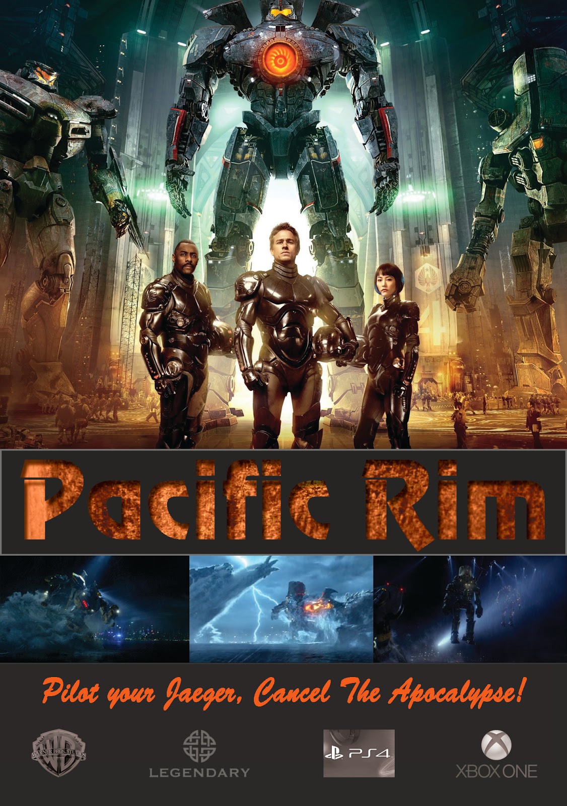
DVD rework.

So here is my pacific rim rework. what do you think?


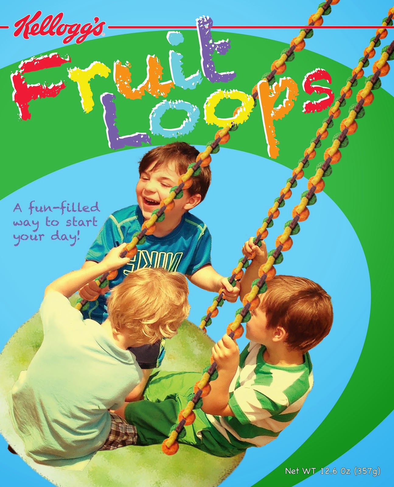
Fruit Loop rework of the rework.

Here is a reworked version with the swoosh moving behind the boys head. The "fun-filled" text is curved and on two lines rather than 3. Also the size of "fun-filled" was increased.

PSA adjustments

Adjustments made based on comments. Logo moved between text blocks and more realistic shadow added to the rim.

Saturday, March 28, 2015

PSA Project.

This is my PSA project I adjusted the text wrap around the tire to fit more uniformly. The NHTSA logo was replaced with a higher resolution image and I placed it in the yellow rectangle. Also added somewhat of a shadow behind the rim and tire.

Friday, March 27, 2015

Fruit Loop Project

Here is my reworked Fruit Loop cereal box. Adjustments made based on class critique and I added more excitement to the background.
Before

after

Monday, March 16, 2015

Brochure rework

Several adjustments made based on the input from comments. What do you think?
I did double check to make sure the circles were indeed perfect circles. I think the images are causing some sort of illusion.

Monday, March 2, 2015

Extinguisher

well here is the extinguisher with some text and something new to sit on. Tried quite a few different versions and it seems to still be floating a bit. Any thoughts on how to remedy this?

Sunday, March 1, 2015

Project #4 massive rework!

I have spent a tremendous amount of time in illustrator and in-design this weekend. I am pretty sure it was well worth it considering the improvements made to my brochure. The changes I have made were a completely illustration of the lure and map, change in colors. I removed two pictures and increase the size of the remaining images. The images are placed in perfect circles. Chris had the idea of shaping the circles into Lilly pads however I just do not have the time to play with that idea. I also have increased the size of the brochure from 8.5" x 11" to 10.5" x 14" folded up to be 3.5" x 3.5". Hope you all like the changes.


Monday, February 23, 2015

Project #3 Pacific Rim DVD

This is my solution for a DVD cover, insert, and DVD label for the movie Pacific Rim. Things that I have changed are brightening the orange pacific rim title on the cover, spine, and insert. I also brightened "spectacular" on the back cover. The body copy on the back cover was bold I changed it to regular and slightly increased the font size to increase readability. I adjusted the legendary emblem on the spine so it is more evenly spaced between Warner bro's emblem and DVD. I also made adjustments to the legendary emblem on the DVD and insert to add contrast. On the DVD I removed the opacity on the pacific rim title and increase the stroke size so it wouldn't get lost in the background.


Sunday, February 15, 2015

#2 Anique Extinguisher

Suggested changes made to this project were to add shadows to the threads where the hose is attached, make adjustments to the letters on the brass label (lower the "L" shrink the "P"), reduce the angle of the surface that the extinguisher sits on. and remove the dark brown along the right edge of the floor. I  made those changes also making adjustments to the shadow and a few other letters.

Monday, February 9, 2015

Portfolio project #1 First Due Magazine

This magazine is designed to target the "first response" community, (Firefighters, Police and EMS providers) 18 to 40 year old men and woman. Critique I received in class were.

1. The name of the magazine did not clearly identify what the magazine was about.
2.The angled bars of orange on the content page blend in with the background and get lost.
3. Different images in the spread may better relate to the articles content.
4.The format of the dates in the footer of the pages were different (this has been corrected).
5.There were grammatical errors that were pointed out and have also been corrected.


Tuesday, February 3, 2015

The number one portfolio I would like to talk about is http://iamrahul.com/. I enjoyed the ease of use of his site and it simplistic arrangement. The web site started off with an eye catching background and the initial information about the website, as you scroll down the page his work is cleanly displayed followed by an about him section and contact information. throughout the page there are multiple links which allow you to jump from work to contact info or the about section.

The second page I found is http://www.circografico.com.ar/ which belongs to illustrator Alex Dukal. This portfolio stood out to me because of the way he displays his work. He displays a few of his pieces in a clickable banner at the top of the page followed by category links. However when you select a category rather than bringing the viewer to a new page the art work in the gallery shuffles around displaying only the work you want to view. The dark grey scale theme and red accents found in his type add to the dark feel of his illustration style.

The third web portfolio I found is http://www.benhulse.com/. This website has a clean clear appearance with a white background, grey logo and text the vibrant colors he uses in his work become the focus. This makes hi work stand out and inspires the viewer to click and take a closer look.