Tuesday, February 24, 2015

Project #2 / Virginia / Flush Left

I've made both columns for the inside text in my FlexPrint brochure flush left, as suggested by Coni. Please give me your feedback so I can decide which version to use, so I can finish this project. Many thanks in advance for your input.

NEW -- Inside spread with text in tan box now FL.

OLD -- Inside spread with text in tan box moved to center.

Monday, February 23, 2015

Project 2—8.5x11 PSA

This PSA (Public Service Announcement) is designed to run as a magazine ad. Its audience is primarily educators and parents of kids with slow processing speed.

Suggested changes included the following:
1) The "IMAGINE" text grabs the readers attention, but will readers stop and read the "if your thoughts..." text? It is harder to read.
     a) Make background whiter or text white
     b) Loosen text so it is not so tight
2) Move "SLOW IS NOT A CHOICE" to the lower right to play with asymmetry.

I tried a couple different options and am curious to hear input on them.
LEFT—The percentage of the white background was almost doubled to make it more opaque, but nothing else was changed. I liked keeping the text tight and black to group all of the black text, including IMAGINE, as one thought. Also, with the white background, it commands less attention.
RIGHT—I spread out the leading of the text, changed the background to black with a small amount of gold glow below IMAGINE to add some dimensionality to it, and moved the SLOW IS NOT A CHOICE logo to the lower right. I didn't think I would like the logo in the lower right but I actually think it is better, creating asymmetry as well as allowing the background art to be more emphasized.

NOTE: My #3 project is an update of a website and will have much more time to complete.


Project #3 Pacific Rim DVD

This is my solution for a DVD cover, insert, and DVD label for the movie Pacific Rim. Things that I have changed are brightening the orange pacific rim title on the cover, spine, and insert. I also brightened "spectacular" on the back cover. The body copy on the back cover was bold I changed it to regular and slightly increased the font size to increase readability. I adjusted the legendary emblem on the spine so it is more evenly spaced between Warner bro's emblem and DVD. I also made adjustments to the legendary emblem on the DVD and insert to add contrast. On the DVD I removed the opacity on the pacific rim title and increase the stroke size so it wouldn't get lost in the background.


Saturday, February 21, 2015

Project #??--Book Jacket Design

Here is a piece that I would like to include in my portfolio but forgot to bring to class for critique. Yes I know there are probably some typos but please ignore them for now =)  This assignment was to recreate the jacket for the book Designing with Type. My idea was to use a refrigerator magnet theme for the letters to give a very "hands-on" feel. I used Illustrator to make the hands and colored letters, the rest is InDesign.


Wednesday, February 18, 2015

SAM - This is the Example I wanted to show you for your Miep Gies Poster!


After doing some research on the time era of anti-war activist Miep Gies and her dutch upbringing I found a font I thought really could work well with your poster. DK Hofstad is an elegant font modeled after Dutch graphic artist Jan Lavies. Jans early series of posters inspired David Kerkhoff to create the Dutch art deco typeface Hofstad.

I had the idea of setting the font up as though the text "She" (Miep) is in the frontline appearing to holding a stance while "defended" kind of fortifies and helps to slightly sheltering around "the defenseless" like in this example:

It was just a thought I had. Maybe overthinking it too much but I thought it might work in your poster.

Monday, February 16, 2015

The Fray Digital CD Booklet

Project #2 The Fray Digital CD Booklet

Change suggested: 
1. Try removing the dripping points on the heart/v of the cover to make it a more noticeable letter V in the word save.
2. Enlarge group photos.
3. Fix grammatical errors on the About the Band page. Example: Started off using first names then switched to last names. Too confusing.
4. Try either a different font or bold the font used in the words: "save a" on the page made up of mirrored Positive/Negative space.
5. Make the "S" a lower case s on the last page to match the cover.

Changes implemented:
1. Removed the dripping points on the Heart/V on the Cover and I rounded out the heart more so that the heart shaped was much easier to see as a V as well. This change seems easier on the eyes.
2. I enlarged the group photos to go outside the box.
3. Along with fixing the grammatical errors, I eliminated some text, zoomed out away from the pulsing heart background to give more space and increased the size of the text just a hair.
4. I wanted to keep that frayed looking rope font seeing how a.The band is called the fray b.They sing about unraveled lives and c.The words  "save a" are supposed to be hanging onto the rope like a lifeline. So I ended up thickening the font a bit and went down on the leading bringing the S A V E closer together to increase it's legibility. 
5. I did the same thickening for the words "Tree of Life" and did some adjusting to make the song list stand out a little more and not get so lost.
6. I made the lower case s on the last page along with changing out the heart/v to the new softer one.
7. Lastly, I adjusted the export settings for a crisper looking end result. (It looked to grainy before).

Before:

After:


Project #3--Ripstik Illustration

Change suggested: Add text.

The idea here of course, is to create the effect of chalk on pavement. Unfortunately, I cannot take full credit for coming up with the phrase as I found similar phrases on a google search for "ripstik posters." But I suppose it was inspiration right?


Sunday, February 15, 2015

#2 Anique Extinguisher

Suggested changes made to this project were to add shadows to the threads where the hose is attached, make adjustments to the letters on the brass label (lower the "L" shrink the "P"), reduce the angle of the surface that the extinguisher sits on. and remove the dark brown along the right edge of the floor. I  made those changes also making adjustments to the shadow and a few other letters.

Project #3 -- Historical Society Magazine / Virginia

This magazine created for the Narragansett Historical Society of Templeton features the 1938 hurricane that devastated Baldwinville. This project originally was done in Quark, but I have recreated it in InDesign since MWCC has dropped Quark to cut costs. (This meant extra work for me now, but a plus for the future in case the historical society decides to adopt this publication.) I selected "Storm Extra Bold" as the font for the headline "1938 Hurricane" and tilted the photos to represent the chaos of the wind.

The town of Templeton is comprised of four small villages, which always haven't seen eye-to-eye down through history (there have been attempts to separate). That is why I selected the "Four Villages ... Sharing One History" banner, in order to reflect unity.

Changes suggested: On the cover, extend the tail on the "g" in "Villages" in the banner so that "Sharing One History" is now on the tail. On the spread, change the position of the headline on the left panel so that it "swirls," matching the swirling of the hurricane in the background image. And I need to remove the bar code.

Changes made: I wanted to get this online for review now, in case I lost power due to Winter Storm Neptune, so I decided not to extend the tail of the "g" in "Four Villages," but I am open to trying this. I "swirled" the headline on the left panel, but I'm not sure it works. So I have posted both the "before and after" panels. I value your input. What do you think?

Magazine Cover
Magazine Contents Page with border for better viewing
Magazine Spread (original)
Magazine Spread (updated left panel)

Thursday, February 12, 2015

Project Rework 2--Miep Gies Poster

Changes suggested:

1. Break up the hard line separating Anne's round "picture frame" from the black background on the left.
2. Lighten the text and headlines.
3. Spread the petals in Miep Gies' shirt over the whole red banner making a pattern behind the entire headline.
4. Get rid of the hand.

Changes implemented:

I think that adding this petal boarder around Anne's frame creates a lot of movement in the design and I like that a lot.  But when I went to try suggestion 3 it was just too many petals and looked chaotic. The same deal with the hand. Believe it or not, the hand helps break up an otherwise overwhelming pattern of flower petals. When I cut it out, the petals took over and it didn't look right (to me anyway).

I lightened all the headlines and it will be noticeable I'm sure in print

I will still probably tweak the petal boarder but please let me know what you think of the concept! Is better? Worse?

Project #2 -- FlexPrint Brochure by Virginia

This brochure with its required die-cut was created to market a fictitious print shop in Gardner named FlexPrint, which uses flexography (or flexo print) to produce high-quality flexible packaging. This print process uses environmentally-friendly fast-drying inks that are perfect for slick surfaces, such as plastic grocery bags, food wrap and even shower curtains. The firm also prints on paper.

In flexography, the flexible flexographic plate with its raised image or text is attached to a roller. A second roller applies a specific amount of ink to the plate, while a third roller keeps what is called the substrate (the material on which to print) pressed firmly against the flexographic plate while it passes between them. Hence, circles, representing rollers, are key to this design, along with the "rollin', rollin', rollin" theme. I also threw in a  bit of nostalgia, just for fun. (Can you sing the theme song for the TV western referenced in the brochure?)

1) Reviewer noted that the images inside the circle looked "blurry" in the printed brochure. However, the images are high-res in the InDesign file (300 dpi). After a few adjustments to the print settings, I printed a second copy of the brochure, and the images are crisp once again.

2) No other updates were suggested or made. Comments, please.

Brochure Folded Front

Brochure Folded Back

Brochure Spread Outside
Brochure Spread Inside

Wednesday, February 11, 2015

#1 - Doane's Falls Brochure Design


This is my reworked design for my #1 "most favored" piece of work.

Changes:
My original design had very flat and blocky structure, so I created new textured topic boxes to give the design more of an earthy look. Along with that I created a vector of a leaf to use instead of having arrows everywhere. This compliments the outdoorsie topic and helps direct the audience from subject to body text.

Instead of having solid colors throughout the entire page I decided to try a gradient, but also kept the dark green dividers that are used on the front and back of the brochure.

Any and all feedback on this would be helpful and please don't be light of criticism, its a wonderful part of the learning experience and I would love to hear what you truly feel would make this a stronger design. Thank you, Christopher Gordon

#2 - Attack on Titan DVD cover

This design was voted as my #2 "most favored" piece of work in class. Now I did not have the file for this design so this is a remake from complete scratch that I created. However, I did make a few changes to it.

#1, I added more texture to the titles words to help enhance the unity it needed with the foreground and background. This make the title more static which generates more appeal when combines with such detailed artwork.

#2 The original text on the background at the bottom had a red/maroon stroke under it before and i changed it to black. Now i did this for a few reasons. One being it hid that text too well and make it much more difficult to read than intended. Two being all the other text is white/grey with a black background of some sort so i wished to continue with that pattern.

#3 All other changed are very minor or random. Due to it being a completely different file I could not recreate the exact same random streaks as before, nor did i intend too.

Any and all feedback on this would be helpful and please don't be light of criticism, its a wonderful part of the learning experience and I would love to hear what you truly feel would make this a stronger design. Thank you, Christopher Gordon

Tuesday, February 10, 2015

Project 1 ReWorked - 20 page Johnny Appleseed Brochure


Project 1 ReWorked


Sorry this was a time consuming 20 page reworking so I was working on it until the very last minute.
Changes suggested:

1. Add the green on pages 18 & 19 throughout brochure.
2. Enlarge map on pages 6 & 7.
3. Zoom in on Wachusett Mountain picture on 4 & 5.
4. Possibly reduce page count. Definitely DO NOT Increase page count.
5. Make the Tourist Info stand out more on page 3.


Changes implemented:

1. I absolutely agree with adding the green to other areas of the brochure! I added it to the diamond line rule and border of pix on pages 2 & 3 and 12 & 13, Header on 6 & 7 and 10 & 11, increased green border to 2pt width on 4 & 5, 8 & 9, added, subheads on 12 & 13.

2. I didn't make the actual map bigger but I did zoom in to make it easier to read then adjusted the numbered apples on the map and added them in the text copy to make it easier to locate the locations along with increasing the font size of the months and changing them to green.

3. I zoomed in to the beautiful Wachusett Mountain picture to show off it majestic size a bit more.

4. I couldn't figure out what I could cut out and did not increase the page count. I also didn't end up making the brochure envelop like I originally wanted to.

5. Bolded and changed the font to black on the tourist info and made a faded white box behind in to be more legible.


Monday, February 9, 2015

Project 1 Reworked--Digital Canvas Magazine


Changes suggested:

1. Lighten Grey bars in contents page and spread.
2. Lighten the furthest left of the three gallery images on cover.
3. Lighten image of guy in lower-right-hand corner on contents page.
4. Try using same thin font used on cover headline on the spread headline.


Changes implemented:

1. Indeed the opacity of those grey bars was darker than the one on the cover but now they are all the same.
2. I originally darkened the image because I thought it was too bright. This was a mistake. It looks better now and will look far better in print than it did originally.
3. He may look too bright now but I know he'll look better in print.
4. Originally the words "Stylized" and "Portraits" were the same thicker font, but now I have used a thinner font in the same family for the word "Stylized" and I like it better. It is slightly thinner than the word "Portraits" and takes some of the weight off the giant words.


Portfolio project #1 First Due Magazine

This magazine is designed to target the "first response" community, (Firefighters, Police and EMS providers) 18 to 40 year old men and woman. Critique I received in class were.

1. The name of the magazine did not clearly identify what the magazine was about.
2.The angled bars of orange on the content page blend in with the background and get lost.
3. Different images in the spread may better relate to the articles content.
4.The format of the dates in the footer of the pages were different (this has been corrected).
5.There were grammatical errors that were pointed out and have also been corrected.


Sunday, February 8, 2015

Project 1—Fish Design—Addendum

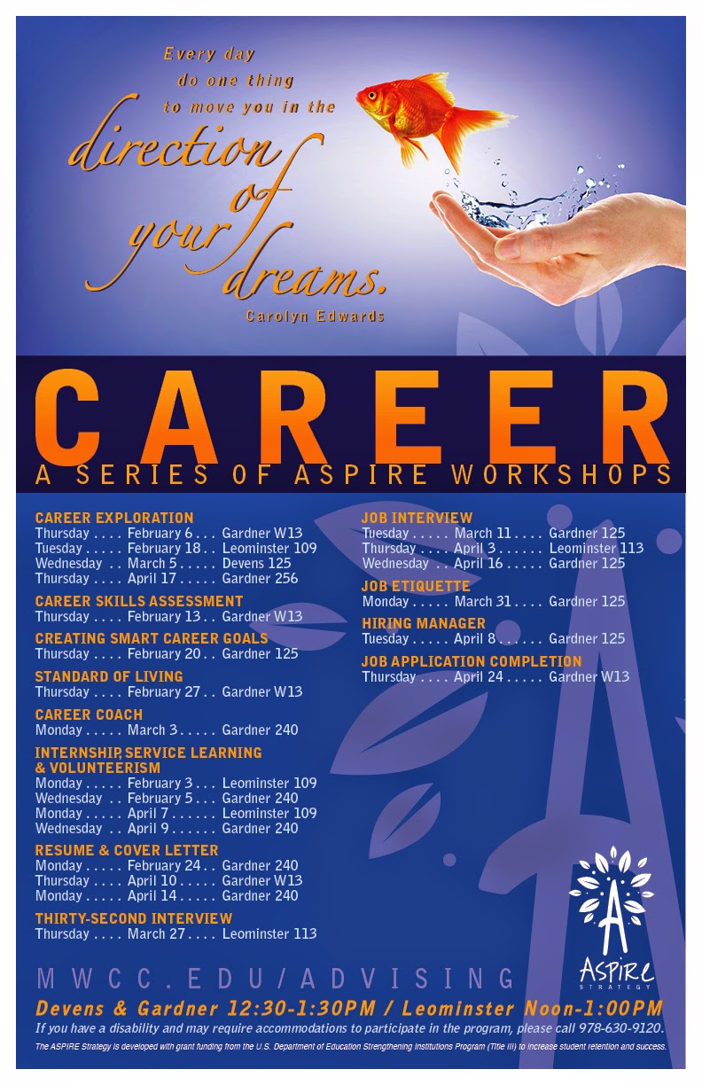
I am aware we need to be careful of not being repetitive in our portfolio. What is the best way to handle a series of designs that all fit within a theme? Based off of the fish design done in my Multi-Media Design class, I was contracted by MWCC to design a series of posters, table tents, web banners, and bookmarks for the school.

How do I show the breadth of the project without boring the audience silly? Below are the followup designs I created after the original fish design. Which, if any, would you include in a portfolio? And for the ones to include, are there any changes you would recommend?

NOTE: The web banner with the blocks was requested by the client. It has bothered me that there was too much tiny text on it. Considering that the banner is seen every time anyone logs onto iConnect, I suggested a change with I hope they will upload sometime soon. The change is included below.
The advising page—http://mwcc.edu/advising/workshops/—shows the tiny text that was removed on the second series I designed.


"Coming together is a beginning;
keeping together is progress;
working together is success.
—Henry Ford


If you don't design your own life plan,
chances are you'll fall into someone else's plan.
—Jim Rohn


College is part of the American dream.
It shouldn't be part of a financial
nightmare for families.
—Barbara Mikulski


Keep your dream close and you'll
go as far as the stars.
—Joseph Farmer


Every day do one thing to move you
in the direction of your dreams.
—Carolyn Edwards

Recently revised web banners.


Topic art on the Advising webpage.


Five bookmarks (front and back)—5-up.

Monthly table tents (finished products are folded in half).