Changes Suggested:
1. Shorten length of text.
2. Remove stray white ticks at top in background from distressed font.
3. Add hidden layer of brown on fin? (My original illustration had a layer at the base of the larger fin with darker color which had been hidden. Keep these darker accents hidden or show on final project?)
Changes Done:
1. I tried the shorter text. Even though I prefer the next as it follows the edge of the fin at the top, I think the shorter text is clearer and more concise.
2. Done
3. Added hidden layer. Still not convinced which way is better. I think I'm too close to the project to make a decision at the moment. What do others think?
NOTE: I enlarged the turtle a bit so that it extended off the page, trying to create a more dynamic view of the turtle. I also added a drop shadow to the body text. Trying to decide if that helps readability or hinders it.
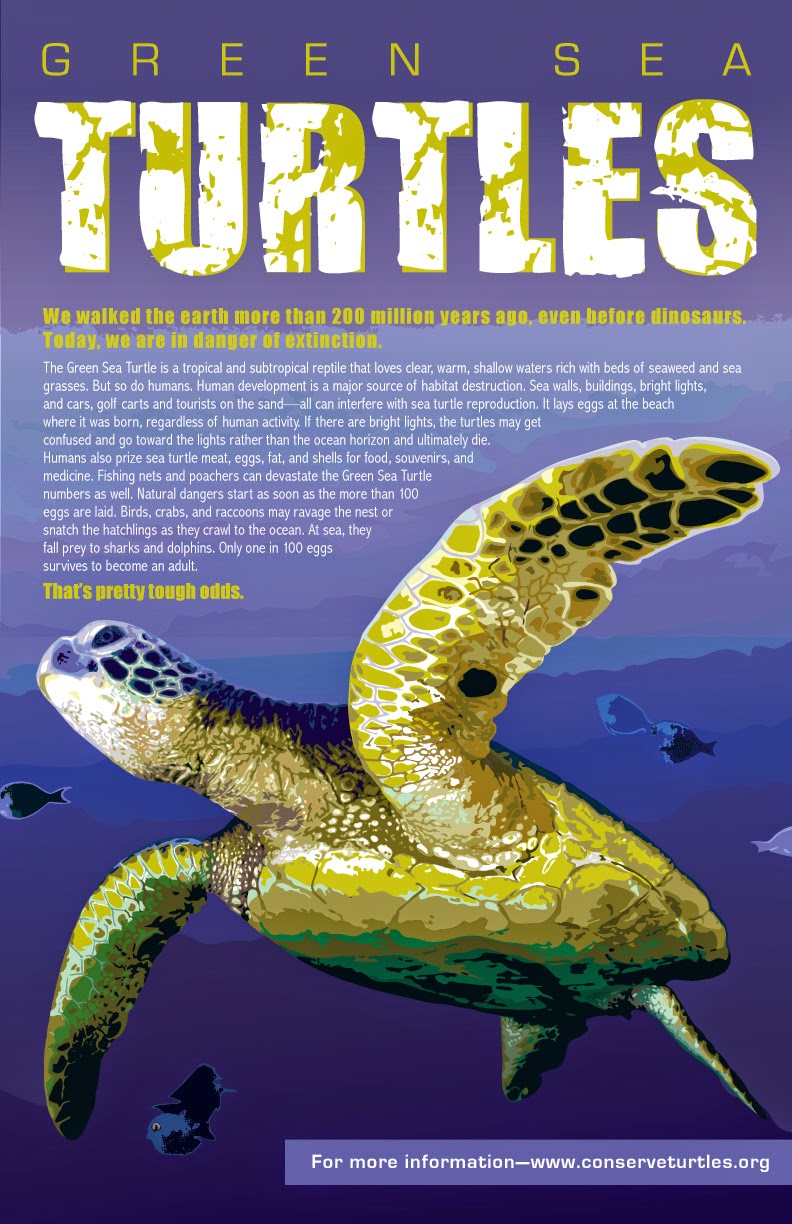

Sue - if you want to enlarge and bleed the turtle, that's fine... but I'm not convinced that the added text below the turtle does anything but "trap" the turtle. Do you need another page element? Where can you add "only 1 in 100 eggs..."? It's an important fact, and I wonder if it could be added to the last line of the subhead... so it would read "Today, we are in danger of extinction... because only 1 in 100 eggs survives..."
ReplyDeleteWhat ever you decide about this line, I suggest it become part of the text block above the turtle, and you let the background negative space alone directly below the turtle. The really strong illustration should have some room to sit without too much around it.
I feel strongly that you don't need the body text shadow. It makes it harder to read. If readability is the issue it might be better to look at an alternative font face... something slightly bolder.
I'm thinking that you might have gone a bit further than you need to go with this - which happens. So, backing up a bit might be in order.
I just saw the Literary Arts Journal covers - and so congrats are in order to you for their choice of your turtle for the cover!